ForeFlight adds 400 new airport diagrams
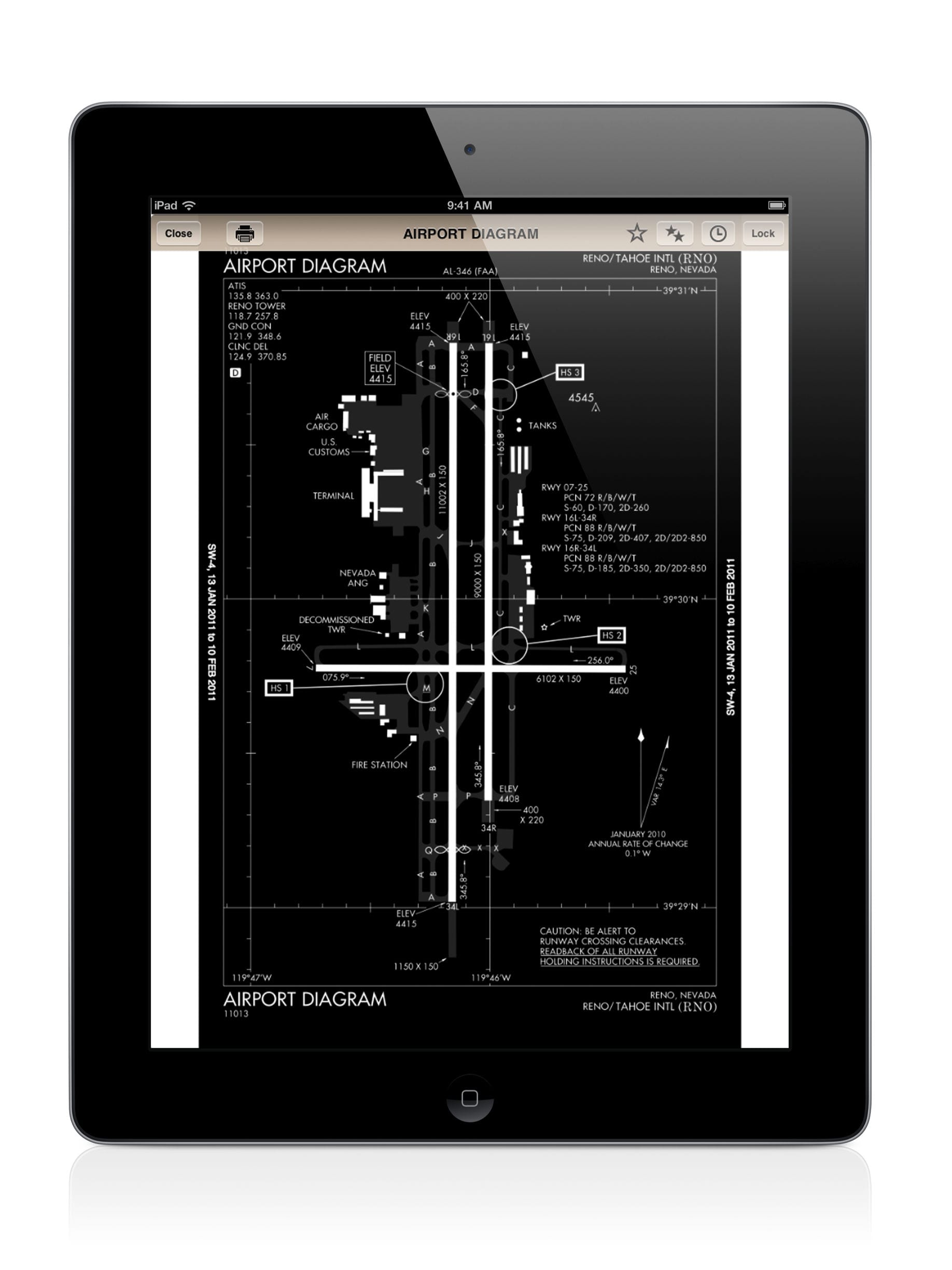
The FAA currently publishes detailed airport diagrams for only a small fraction of the 5,200 public use airports in the U.S. They are primarily available for the larger tower-controlled airports and depict runways, taxiways, FBO locations, buildings and more. ForeFlight has been hard at work to improve this, and as of last week subscribers now have access to detailed airport diagrams for 400 more airports. ForeFlight has drawn each of these up from scratch, and they are as detailed and accurate (if not more so) that those produced by the FAA.
ForeFlight Pro subscribers will benefit further from these since they are all geo-referenced and will display your aircraft’s position on the chart. This can be especially helpful at night when taxiing at unfamiliar airports. In addition to geo-referencing, the diagrams integrate with all of the existing ForeFlight features like plates on maps, annotations, runway proximity advisor alerts, and the auto-display of the diagram upon landing.
To see if one of the airport diagrams is available for your airport, first download the mid-cycle Airport Database update from the Downloads section of the app. Then go to the Airports tab and tap the Taxiways button at the top right of the screen to display the diagram. If the button is grayed out that means that there is not an airport diagram available for your airport–yet. ForeFlight is working to create one for every airport in the U.S., so stay tuned.
They are taking requests though through Twitter and Facebook to help bump your airport up on the priority list. You just need to include the hashtag #ForeFlightMyAirport along with the airport ID and ForeFlight will adjust that airport’s priority for future updates.
- Heads-up, hands-free: How to use iPad audio alerts for safer flights - March 18, 2026
- Monitor fuel status and flight times with SkyTimer’s new iPad app - March 13, 2026
- iOS Update Green Light program: iOS and iPadOS 26.3.1 - March 5, 2026


