How to organize your approach plates in ForeFlight
One of the best features of iPad apps like ForeFlight Mobile is how easy they make it to organize and update your instrument approach charts. Instead of flipping through pages of paper, now you can simply search for the right airport, pick a chart and zoom in on that fine print. But how do you keep all your charts organized? Here are some tips to help.
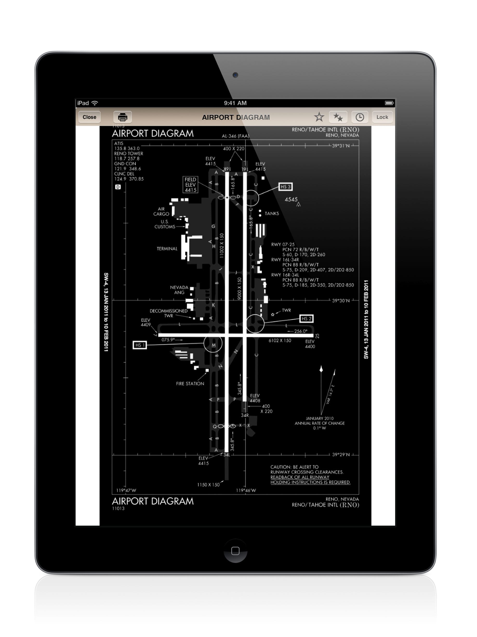
In ForeFlight Mobile, you can view instrument approach charts from multiple screens. For preflight planning, tap the Airports tab, then the Procedures button (4th button from the left). From here, you can review the airport diagram, arrivals and approaches from the same spot you learn about weather, fuel prices and frequencies.
But in-flight there’s a better option–tap the Plates tab at the bottom. This is the place to view all your instrument charts:
- Airport diagrams
- Runway incursion hot spots
- Take-off minimums
- Departure procedures/SIDs
- Arrival procedures/STARs
- Instrument approaches
There are two ways to view plates from this tab: using the search box at the top right of the screen or tapping the “Tap to add plate here” button that shows up when the screen first appears.
The search is smart–enter KPDK and a drop down menu will show you all of the available plates for the Peachtree-DeKalb Airport, arranged by type of procedure. Tap the name of the procedure to view the plate right away, or tap the blue + symbol next to a chart to add it to the list of charts that are displayed as previews on the main screen. You can even specify the type of approach: entering KPDK RNAV will only show the RNAV approaches to the airport.
Likewise, the “Tap to add plate here” button is also smart. It will suggest airports based on the airport you last reviewed on the Airports tab, the route entered on the Maps tab and recent airports. If the airport is not in any of these lists, there is a search box at the top of this menu as well. Choose an airport, then choose a procedure.
But there’s an even more powerful way to organize your plates: by creating your own custom chart binders. This is a very handy but under-used feature in our experience. Taking the time to load and organize all your plates into a binder before your flight will save time and frustration in the air. You’ll have only the charts you want, all in the same place.
To create a new binder, tap the arrow button at the top of the screen to display the Binders drop down menu. From here, tap the + symbol to create a new binder. ForeFlight will prompt you to name the binder (e.g., Oregon Trip), then hit save. From here, you can load up plates as described above (using the blue + button). And you choose the plates to display and the order to display them in. Hate NDB approaches? Don’t add them to your binder!
You can also edit binders quickly, using the Edit button at the top left of the screen. This allows you to remove charts from the binder (they’re still stored on your iPad) or reorder them (tap and hold the plate you want to move, then drag it to the new position). You could, for example, have all your arrival procedures in order, then approaches, then the airport diagram.
There are a number of potential uses for Plates binders, including:
- Commonly flown routes–make a binder for each trip, including departure, destination and alternate
- Local airports for practice sessions
- Geographic areas you may travel to regularly (e.g., Southern California)
You can create numerous binders, so take the time to organize your most-used charts. Once you’ve created the binders, the charts are automatically updated when you download new databases (from the Downloads page). To navigate between binders, simply tap the arrow at the top of the screen and choose from the drop down list.
Here’s a quick video tip showing the feature in action:
- How to Improve Your iPad’s Battery Life - February 19, 2026
- Do I really need to use Airplane Mode on my iPad or iPhone Pilot? - December 31, 2025
- Flying with the Garmin D2 Mach 2 and D2 Air X15 - October 28, 2025


Just another reason why ForeFlight has no competition!